When shaping information, either as a designer or an information manager, the chosen view depicts what is told. See for example, the dutch article “Subjectieve bewijsvoering (Subjective reasoning)” about the cholera map of Snow.
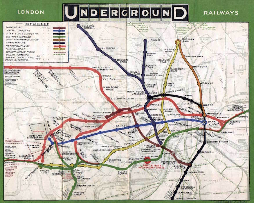
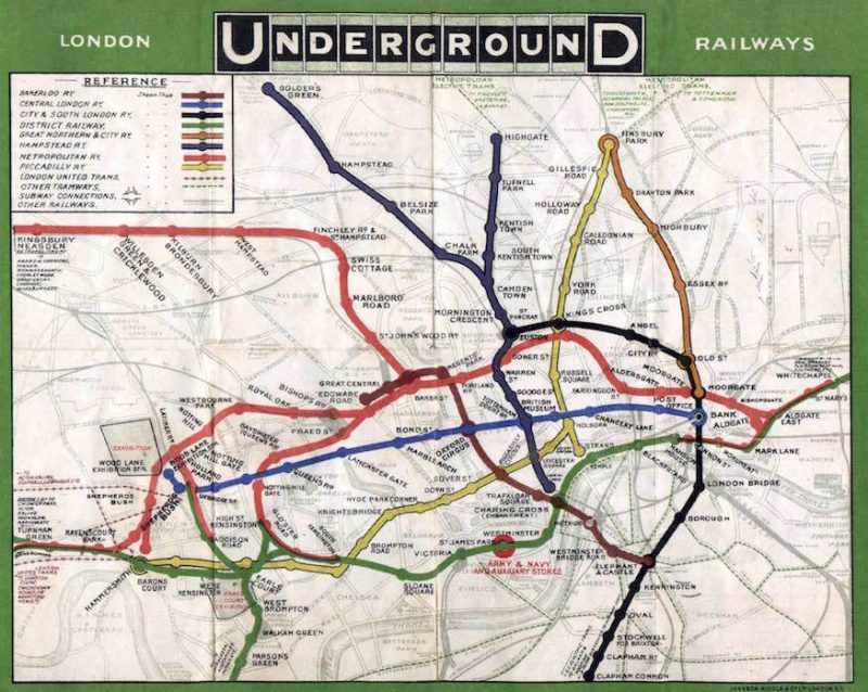
Another example is the Underground Map of London. The map of 1908 tells us about the real geographic locations of the railway stations. The river Thames, Kensington Gardens, Baker Street, and Oxford Street all geographical locations are visible. You could use it for walking to the station entrances.
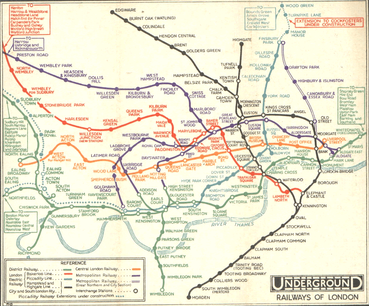
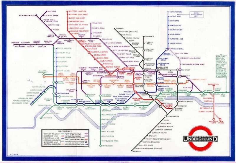
But through time, when lines and stations expanded, the map became cluttered and complex. They removed all geographical information as a first step towards today’s underground map, although the line was still geographically correct. In 1932, the map looked like a vast and complex system. And the distance was still displayed. The locations of the more far-way stations that didn’t fit on the map were mentioned as text in the margins.
Then in 1933, one of Britain’s great design icons, the London Underground Map was made. Harry Beck, an engineering draftsman, designed a schematic diagram. Instead of representing the actual geographical position of the stations, it shows the orientation and connections of the different lines. The information about the distance between the two stations is abandoned. Something I learned the hard way on one of my first visits to London. I took the tube to find out later that instead of sitting for 20 minutes in the metro, I could have walked it in just a few minutes.
Beck, with his background in engineering, put some sense in this complex geographical system by recognizing that not the distance was necessary for underground travelers, but the connections were. He recognized that the viewpoint depended on the goals of the user. And subway users need information about crossroads.
Related information
- BBC TV 4 – Design Classics – The London Underground Map.avi (a must-see!)
- Wikipedia: Tube Map.
- Icons a portrait of England: The Tube Map, Harry Beck’s Iconic Map.
- Transport for London. Todays underground maps.
- Historical collection of many maps of the London tube: The London Tube Map archive
- London Underground maps (+ worldwide subway maps), Jim Heimer